Design Background
The reason for the webpage reconstruction was primarily due to the outdated nature of the original website. Additionally, the product pages on the original website lacked completeness. Therefore, the goal of this project was to redevelop the website from the ground up, focusing on overall architecture and product presentation. The aim was to provide users visiting the website with a better user experience.
Role and Collaborations
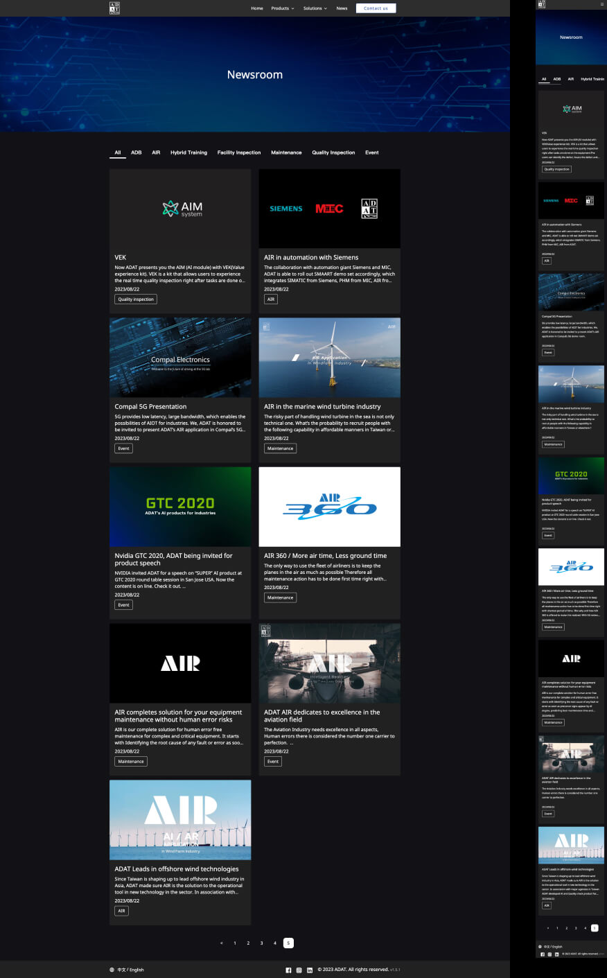
As a product designer, in the early stages, I focused on the reconstruction of the information architecture to define the navigation menu for the new official website. In areas where the categorization of the latest news is more complex, I utilized the card sorting method and engaged in discussions with team members to define corresponding categories.
In terms of visual design, I established a design system for the official website to ensure a consistent overall design. Additionally, I implemented continuous monitoring of the website's effectiveness through SEO and Google Analytics. This serves as a consideration for design iterations and improvements.
Team
Product Designer - Windy Wu
Frontend Engineer
Backend Engineer
Platform
Web
Tools / Skill
Figma, Photoshop, Illustrator, Html, CSS, javascript
Design Goal

Information Architecture
Ensuring the clear and organized structure of the official website, with a rational organization of navigation menus and pages, to facilitate users in quickly finding the information they need.

Emphasis on Key Content
Highlighting the core messages and important information on the official website to guide users' attention towards key details.

Continuous Iteration
Regularly collecting user feedback and, based on data and input, continuously optimizing and improving the official website.
UX improvement
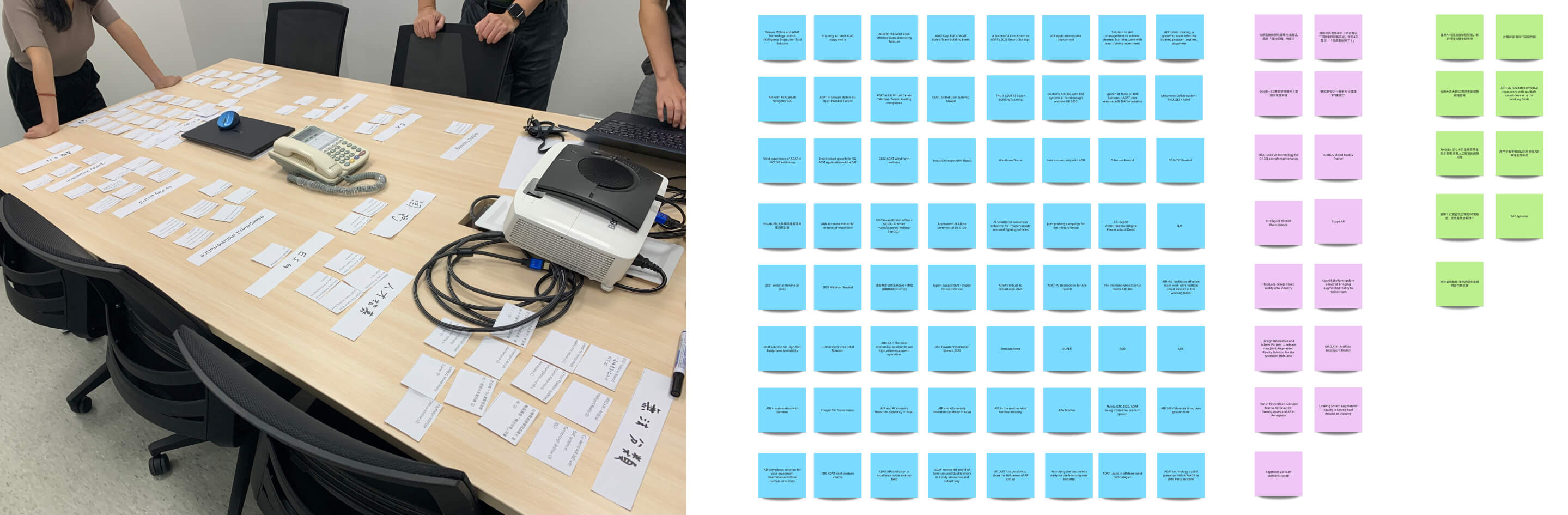
Card-Sorting
In this website redesign project, card sorting was primarily used to redefine the navigation bar and categorize the latest news. In the initial phase, cards were organized based on all categories from the old website, and team members were invited to discuss together. These discussions covered the definition of navigation bars and categories to ensure the rationality of the navigation structure and news classification during the redesign process.
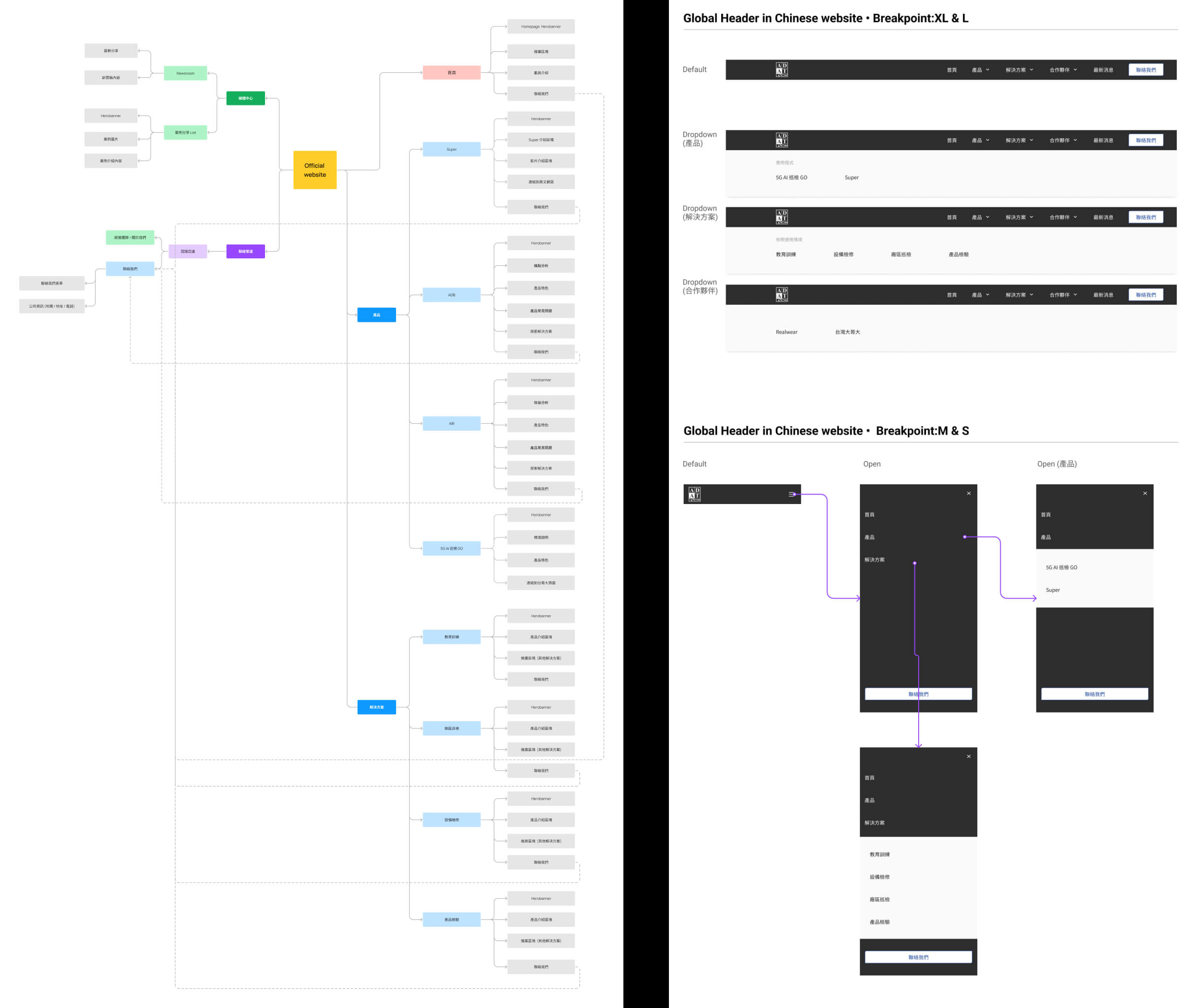
Redefine the functional map
Based on the design discussions, a functional map has been redefined, and computer and mobile versions of the navigation bar have been created based on the redefined navigation structure.
Design Language System
In defining the text system, we first establish the size of 1rem as the baseline. Then, we define corresponding sizes based on HTML tags. Additionally, to ensure certain emphasized points stand out, we assign a larger size to the text needing emphasis for higher contrast.
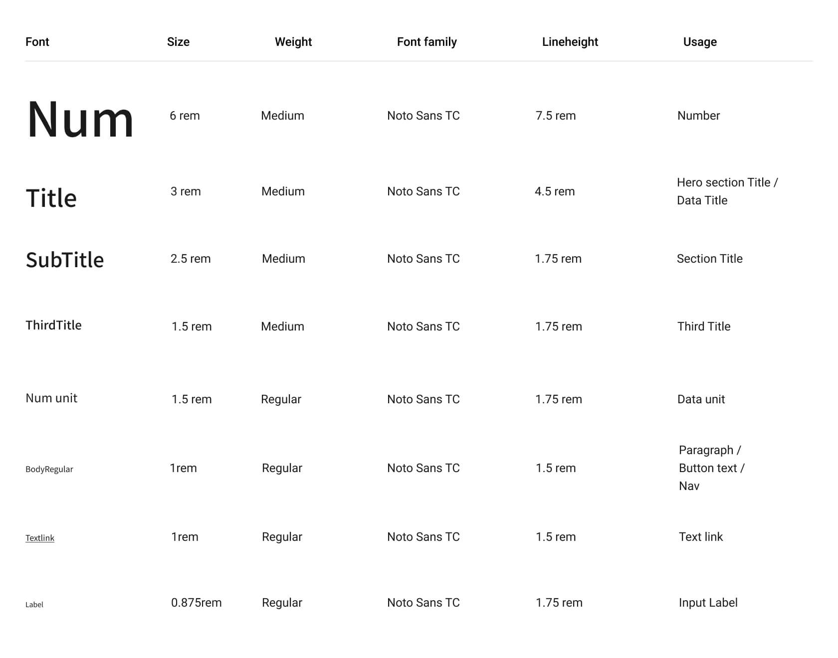
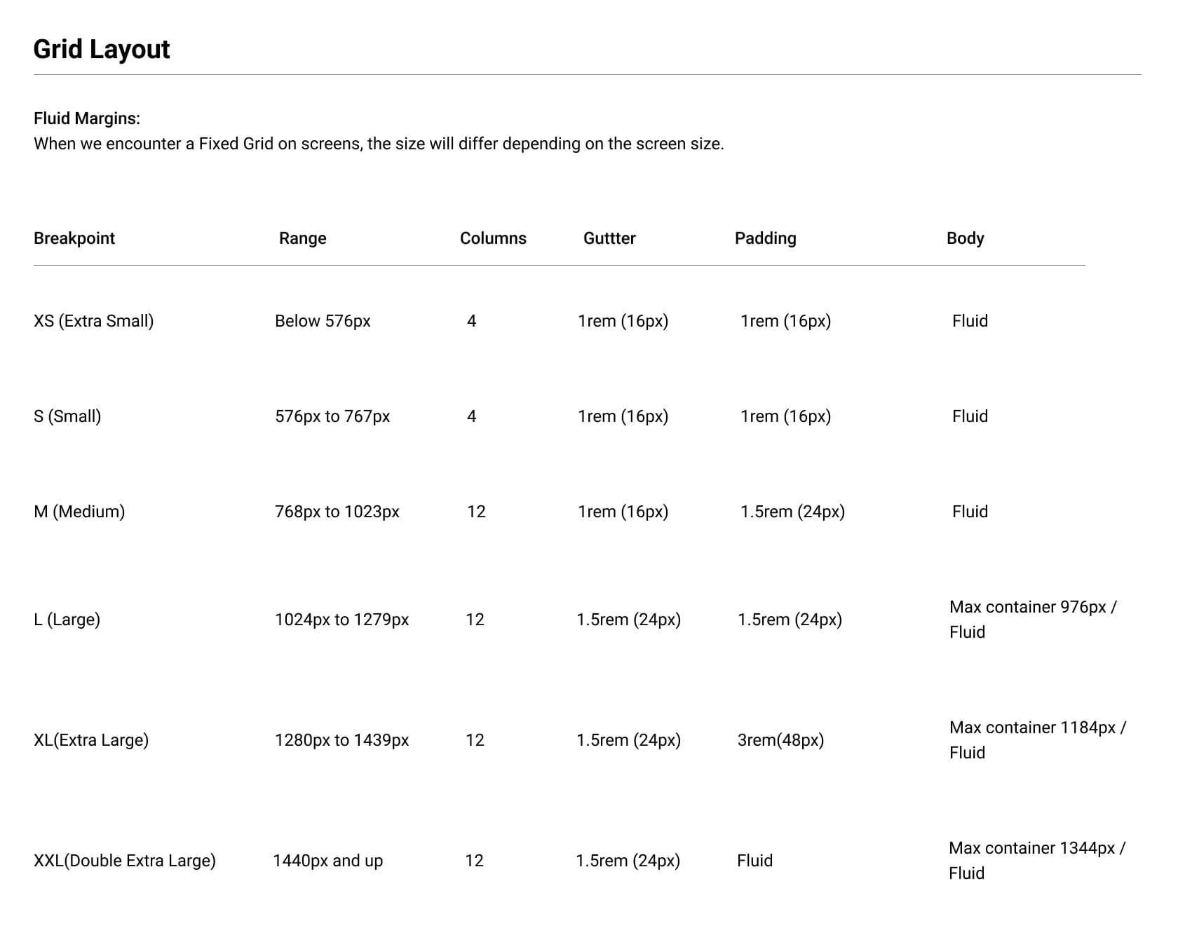
To align with responsive web design, the design system's definition includes different breakpoints for the grid layout. This enables smoother communication between designers and engineers, ensuring consistency across various device sizes and enhancing the overall user experience.
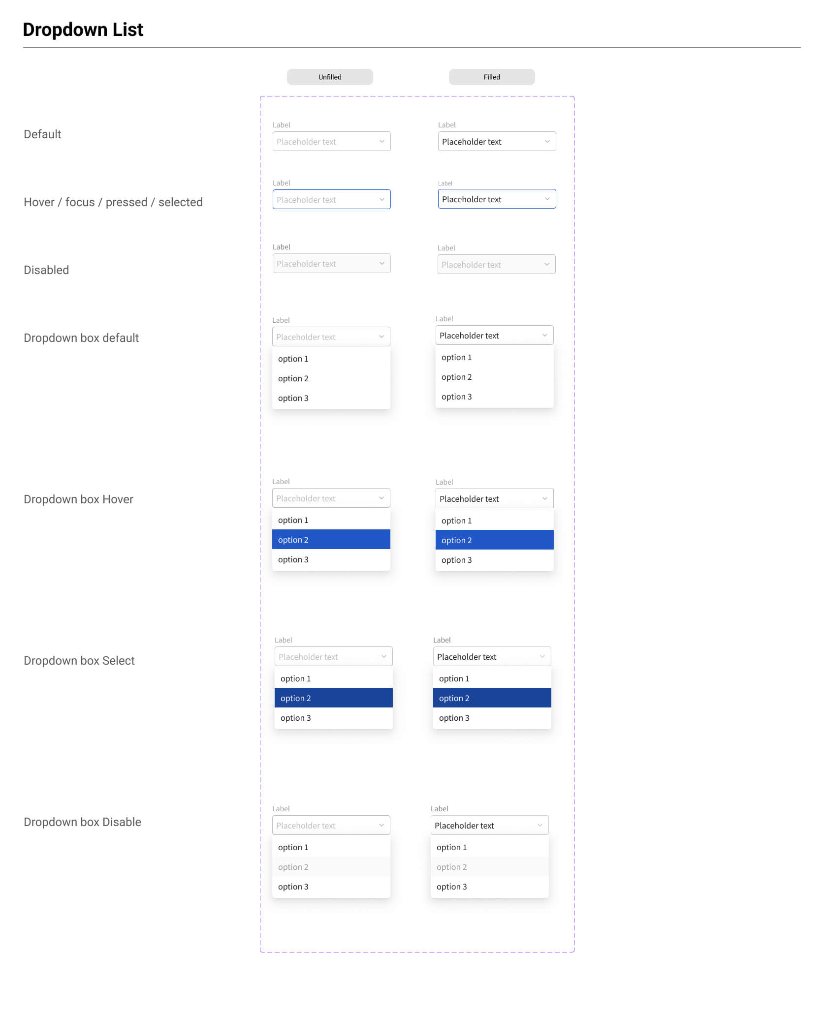
In addition to defining basic text colors and grid layouts, all states required for form filling or dropdown menus are also defined modularly. This approach allows for application across other pages of the website, ensuring consistency and scalability throughout the design system.
Data tracking
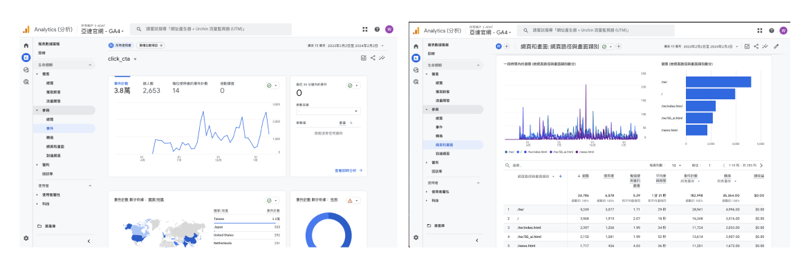
In terms of data tracking, due to the absence of Google Analytics tracking on the official website initially, I am responsible for setting up data tracking on the official website using Google Tag Manager (GTM). Additionally, I will utilize the data to execute the design iteration.
Homepage
The homepage adopts a new navigation menu for overall categorization. Product promotions and event announcements are displayed using carousels to present various promotional content. Additionally, the homepage utilizes prominent data-driven promotional content to contrast and highlight its offerings.
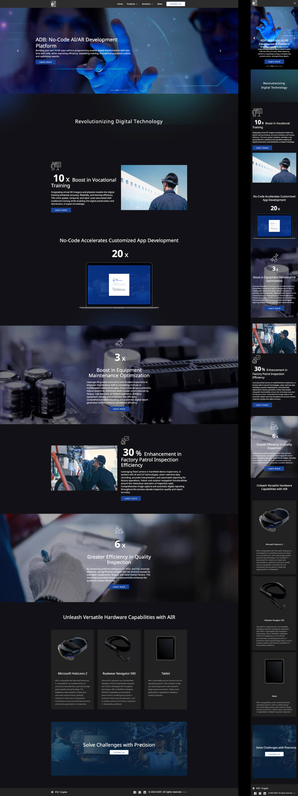
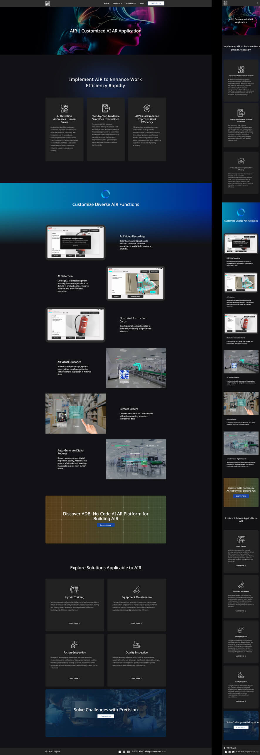
Product
In the process of reconstructing the product pages, we've considered future scalability and design consistency. We've opted for a modular design approach on the product pages to facilitate easy expansion and ensure uniformity across different product pages. This enables quick application of corresponding page content to various product pages in the future.
Newsroom
After defining the latest news through preliminary card sorting, discussions were held with backend engineers regarding the creation of corresponding items and content for the backend. Furthermore, discussions with team members focused on defining backend requirements to better align with content posting needs.
Take away
This project provided significant learnings in terms of data tracking, particularly transitioning from GA3 to GA4. There were differences in data definitions, and through careful observation and learning from data, we iterated on the design more extensively.
Throughout the project, we maintained regular fixed meetings to track progress and occasionally held UX improvement meetings to discuss the reconstruction of specific content. Moving forward, we aim to conduct more UX improvement discussions focusing on various functionalities to enhance the overall user experience.